LOOKING PAST RESPONSIVE DESIGN
Every new website coming out these days should be using responsive design, scaling to the device of the user, and if they’re using the latest trends, they’re probably using flat design too. Every website we navigate to here at Software Assistance feels like we’ve accidentally clicked out of the web browser and straight into the flat-tastic Metro Windows 8 startup screen, so popular is flat design.
Websites don’t just have to copy the latest trends though – it’s important to be looking into the future when you’re designing a website, so the end result doesn’t come out looking archaic and dated. Even if you’re designing a clean and functional site, it still should be recognisable as new. It’s like going out in a new outfit; you’re expecting comments.
Our best bet for the new trends in web design are to look to other industries. More to the point, it’s looking at the places web designers have taken from before, like the fashion industry.
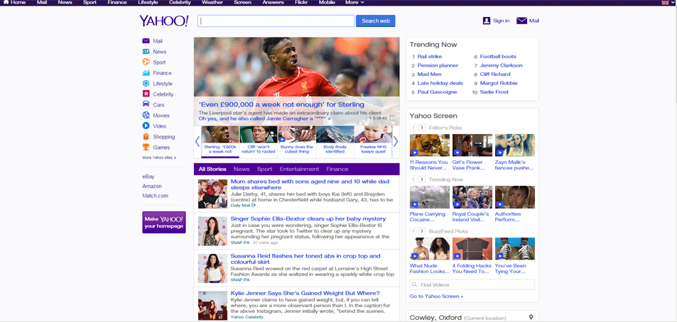
There’ve been a few articles in the last few weeks talking about minimalism and how its pushing its way from architecture and fashion to web design. While we’re a big fan of flat or minimalist design, and indeed we’ve designed more than a few websites in that style, we believe flat design is a direct response to the overly ornate and bloated websites that came before it. Think the Yahoo homepage for example. It recently went through a redesign, but even that couldn’t rid of its reliance on heavy text and small numerous images. Meanwhile the likes of Amazon had moved to single or few large images and highlighting their content with white space.
Flat design works perfectly as a counter to the excess that came before it, but we believe its popularity will wane as more websites come through their redesign and slim down. Eventually, people will start looking for sites more aesthetically pleasing and interactive than minimalism.
ENTER PATTERN DESIGN
With every business having a web presence, businesses are looking into ways to differentiate their product from one another. They want to be seen as being unique and different. One way to do that is doing something different with your website, perhaps employing an audio-visual metaphor.
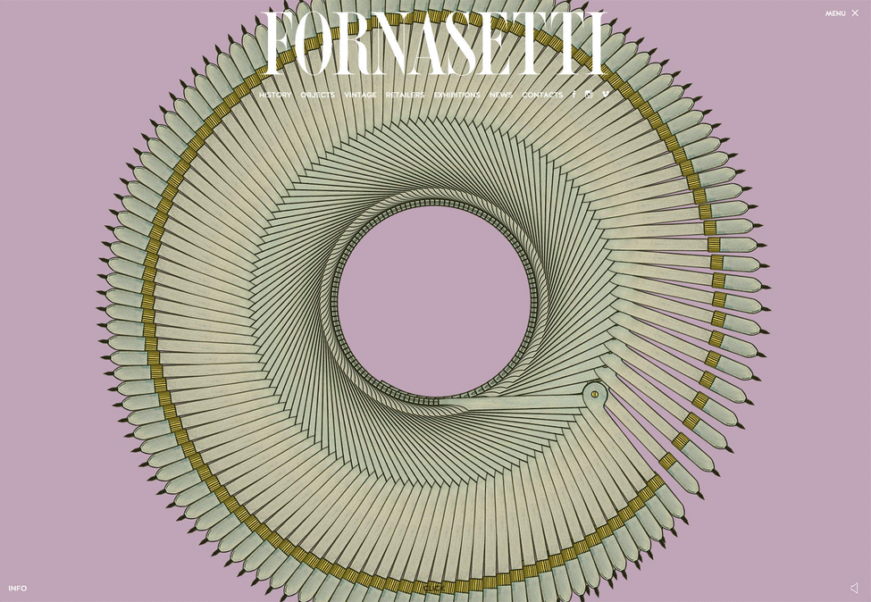
Browse, for example the Fornasetti site. It uses music, visual patterns and parallax storytelling to bring its rich heritage to life, showcasing its artistic reputation. Would you be surprised to see a similar technique employed with the website of a major fashion agency or e-commerce site?
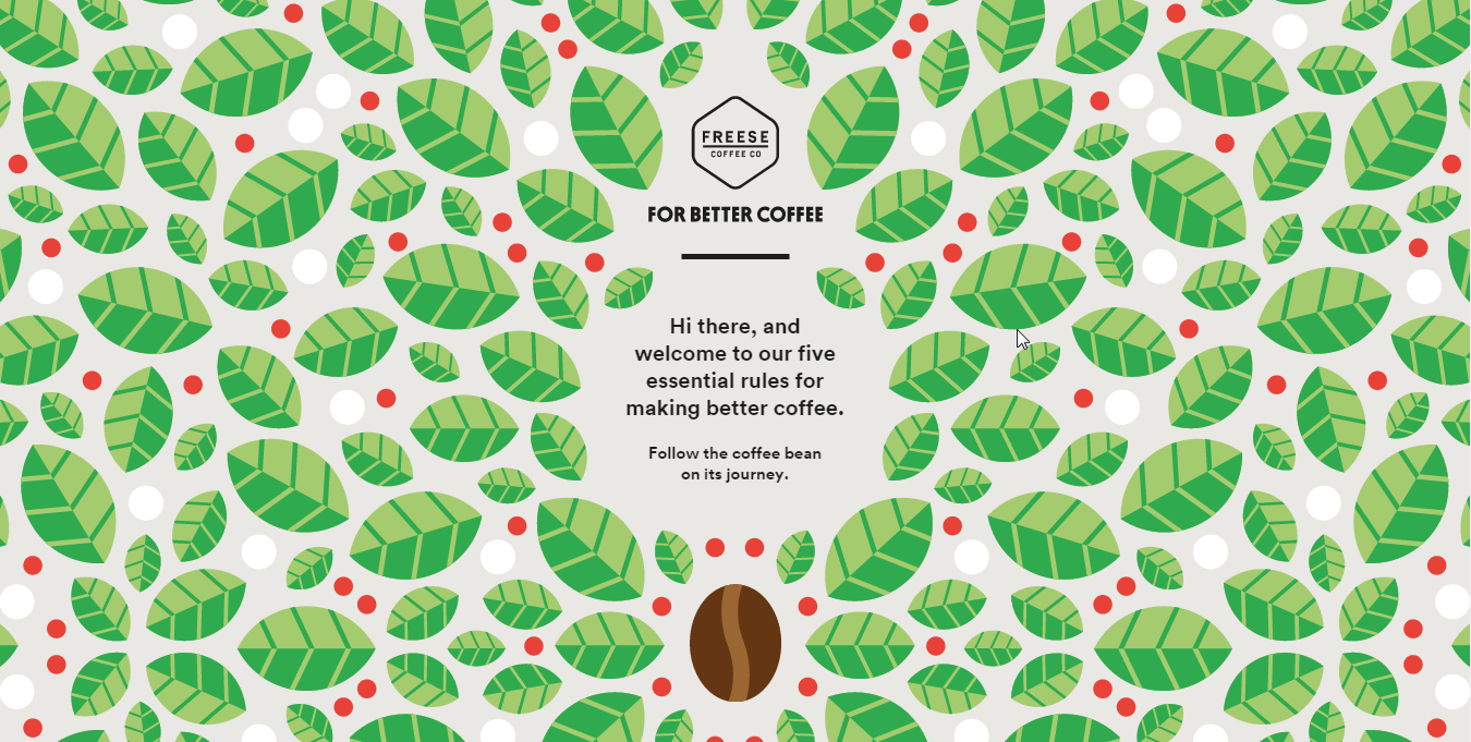
The advancement in HTML5 and CSS in websites means designers are finding it easier to bring their visons to life. Geometric particle systems have been thrown around by web designers since the ‘90s, but now machines and browsers have the power to navigate to websites using them without heavy slowdown. Meanwhile, real life arts and crafts are exploding thanks to platforms like Etsy and Pinterest, where artistic interests are shared and commercialised. This push in crafts is inevitably coming to web design, resulting in sites like the Freese coffee site below. Could you see a site like this being made before the Etsy revolution?
In conclusion, while we expect to be making flat minimalist websites for some time yet, we also expect to see an explosion in pattern fashion designs, particularly patterns that are animated or looping. In particular, keep an eye out for interactive particle animations on homepages, as well as sites that look inspired by old school arts and crafts.
We suspect that’s the truth behind the correlation between web design and fashion. Both take the same mainstream cultures as inspiration, and arts and crafts designs will be infiltrating both industries in the near future.


